00 — Data & Methods
How we built our project
Here is an overview of what we used, why we used it, and where it falls short.
Spatial unit
We aggregated all data to the census tract level.
The LODES8 data was available at a block level, but the ACS (American Community Survey) data used for population was available only at the tract level, so this was necessary to do.
The transit travel times in section 4 were calculated using the centroids of each tract.
Since tracts are drawn to capture roughly the same number of people in each, using the centroid to calculate travel times results in a better estimate in the denser, urban tracts (which are smaller) than the more rural tracts on the edges of the Bay Area.
Equity Priority Communities
MTC EPC shapefile, 2022. EPCs are census tracts identified by the Metropolitan Transportation Commission (MTC) as facing compounding disadvantages, based on data from the ACS (American Community Survey).
To qualify, census tracts must meet the necessary criteria of containing at least 28% low-income residents, as well as meeting several of the supporting criteria, such as containing at least 70% people of color, 15% zero-vehicle households, and 14% rent-burdened households.
For our analysis, the supporting requirement of at least 15% zero-vehicle households is important context when investigating commute accessibility by public transit, and is justification for paying particular attention to transit accessibility for residents of EPCs.
Origin-destination data
LODES8 — 2023 LODES data was used, to harmonize with the ACS 2023 5-year estimates, the most recent data currently available. LODES data captures workplace-residential pairs for covered workers, but misses jobs like self-employed, remote workers, and informal work.
R5Py — R5Py was used for routing in our project, simulating the public transit routes and car driving routes between the OD pairs of tracts. R5Py uses Open Street Map data and GTFS data to calculate commute times, but doesn't take traffic into account.
Population data
B08302, 2019 - 2023. ACS time of departure to work data comes from self-reported time rather than modelled travel times. This reflects actual reported experience, available at tract level, consistent with LODES geography.
Data cleaning & missing values
For the LODES8 California 2023 OD dataset, there weren't many issues with the data. The dataset was checked for duplicates, but none were found. The GEOID columns were cast as strings so that no issues would come up. The column naming convention was already very readable, so nothing was done to change that. A column was created that took the full GEOID and sliced it to include only the state and county parts. This was then used to filter for the 9 Bay Area counties as defined earlier in this report. Another column was created that took the full GEOID and sliced it to include the state, county, and tract. This was done to help with filtering in future functions. The data was then saved to a parquet file.
Dark Data Type 1 - Data we know are missing
Self-employed, remote workers, gig workers, and informal workers are missing from LODES coverage, which could result in underrepresentation in EPCs.
Although there is nothing we can do to mitigate this missing data, it is important to acknowledge the bias that this introduces into our visualizations.
Travel times for cars calculated using R5PY represent free-flow traffic, which is an unrealistic representation of what the average rush-hour commute consists of.
Dark Data Type 3 - Choosing just some cases
The LODES and ACS data used in our visualizations are from the universe of workers aged 16-years and over who commute to work.
This fails to include anyone who doesn't work, doesn't commute to work, or is under the age of 16.
This is sufficient for our analysis on commute patterns, but does not present a complete picture of EPCs and equity considerations.
Dark Data Type 4 - Self-selection
All the data that we are using are based on ACS responses, which residents are given the option of filling out or not.
This can result in bias as certain groups are less likely to respond to the ACS, such as minority communities and those with unsecure immigration status.
Dark Data Type 7 - Changes with time
Firstly, the MTC designation of EPCs is based on 2018-2022 ACS data, and LODES and ACS data used are from 2023.
The underlying characteristics of the census tracts that made them EPCs may have changed in the interviening years.
Secondly, the modelled travel times for public transit commutes are based on transit schedules, which may change over time.
Dark Data Type 9 - Summaries of data
In all of our map visualizations, we are summarizing data at the census tract level.
By doing this, we obscure the details about individuals - in the visualizations we don't see the range and distribution of data within census tracts.
Furthermore, when we compare averages between counties, we lose information about the variability within each county.
Dark Data Type 11 - Feedback and gaming
There is a chance that, in answering the ACS, respondents may provide 'desirable' answers rather than truthful ones, leading to biased estimates.
01 — Setting the scene: Daytime Population
The daytime population distribution of the Bay Area looks very different than where people reside at night
When a huge transportation network allows for wide differences in where people live and work, the maps for daytime and nighttime population can look very different. Residential population, the geography we're most used to, tells us where people are in the evenings. During working hours, a very different spatial pattern emerges.
Using LODES8 origin-destination employment data, we mapped where the Bay Area's workers are located at night (their home census tracts) and where they are during the day (their workplace census tracts). The contrast reveals the scale of the region's daily spatial reorganization. Note the colorbar scale difference between the maps!
Figure 1. Residential distribution of Bay Area commuters by census tract. EPC tracts outlined. Data source: LODES8. Census tract level aggregation.
Figure 2. Workplace distribution of Bay Area commuters by census tract. EPC tracts outlined. Data source: LODES8. Census tract level aggregation.
As expected, the distribution of people is much more concentrated in the daytime map, particularly in downtown San Francisco and Santa Clara. Census tracts that contain the airports (SFO, OAK, and SJC) also show high daytime populations. Looking at the outlined EPC tracts (Equity Priority Communities - census tracts designated by MTC as facing compounding disadvantages including low income and limited car ownership), the trend shows a more distributed population during the night and low population during the day, which follows the same pattern as many residential neighbourhoods in the Bay Area.
These maps clearly show the difference between nighttime and daytime populations, raising the question - how do commute patterns vary between different groups of people, and how are these commute patterns served by public transportation?
The population distributions reflect covered LODES workers only; self-employed and remote workers are excluded, which may disproportionately affect certain tract types.
Although EPC tracts display a similar pattern to the overall Bay Area - daytime concentration and nighttime distribution - is there a difference in the strength of this pattern?
02 — The flow of commuters
Some places fill up during the day. Others empty out.
The difference between nighttime and daytime worker population - the net change from night to day - reveals which parts of the Bay Area absorb workers from elsewhere, and which areas export them.
Job centers like downtown San Francisco and Santa Clara County see large daytime population increases, while residential areas see large outflows. The map and chart below show this daily ebb and flow across the region.
Figure 3. Net change in worker population (night to day) by census tract. EPC tracts outlined. LODES8. Census tract level aggregation.
Figure 3 reveals the daily reconfiguration of workers throughout the Bay Area, and suggests a poly-centric nature to the spatial distrubution of employment locations. Zooming in on the outlined EPC tracts, there are EPCs that both 'import' and 'export' workers, with no obvious difference between EPCs and the rest of the Bay Area in this regard.
Although it can be insightful to observe the spatial pattern across the whole Bay Area, large differences in demographics, built form, and local governance mean that it can be less relevant to compare daytime and nightime worker populations at such a large scale. To account for the highest level variation, the figure below compares daytime and nightime worker population by county. San Francisco and Santa Clara counties represent the highest influx of workers during the day, while Solano and Contra Costa represent counties with higher residential populations, and fewer workers during the day. It is important to note that within all counties there is still a huge amount of variation, so this insight is still generalized.
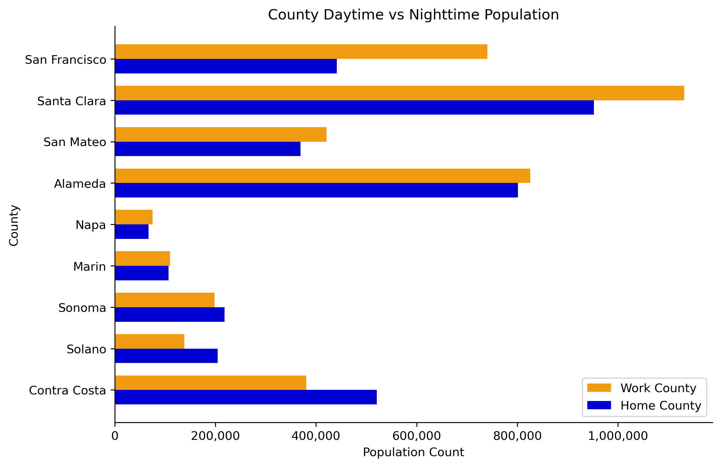
Figure 4. Net daytime worker population change by Bay Area county. LODES8. County Level Aggregation.
These flows represent millions of commutes every workday. Is the burden of these commute flows shared evenly between workers, or does it fall harder on some residents than others?
The population distributions reflect covered LODES workers only; self-employed and remote workers are excluded, which may result in an overemphasis of the strength of the concentration of workers during the daytime.
Does the apparent clustering of commute destinations result in a wide range of commute durations, as residents from around the Bay Area commute to the same few locations?
03 — Equity Priority Communities
Equity Priority Communities experience the outflow differently
Equity Priority Communities (EPCs) are census tracts identified by MTC as areas with residents who face disadvantages such as lower incomes, higher pollution burden, lower car ownership, and limited access to opportunity. Are they also disadvantaged by their commute burden?
Below we look at the distribution of in- and out-flows from EPCs in orange, and compare this with that of the whole Bay Area, in blue.
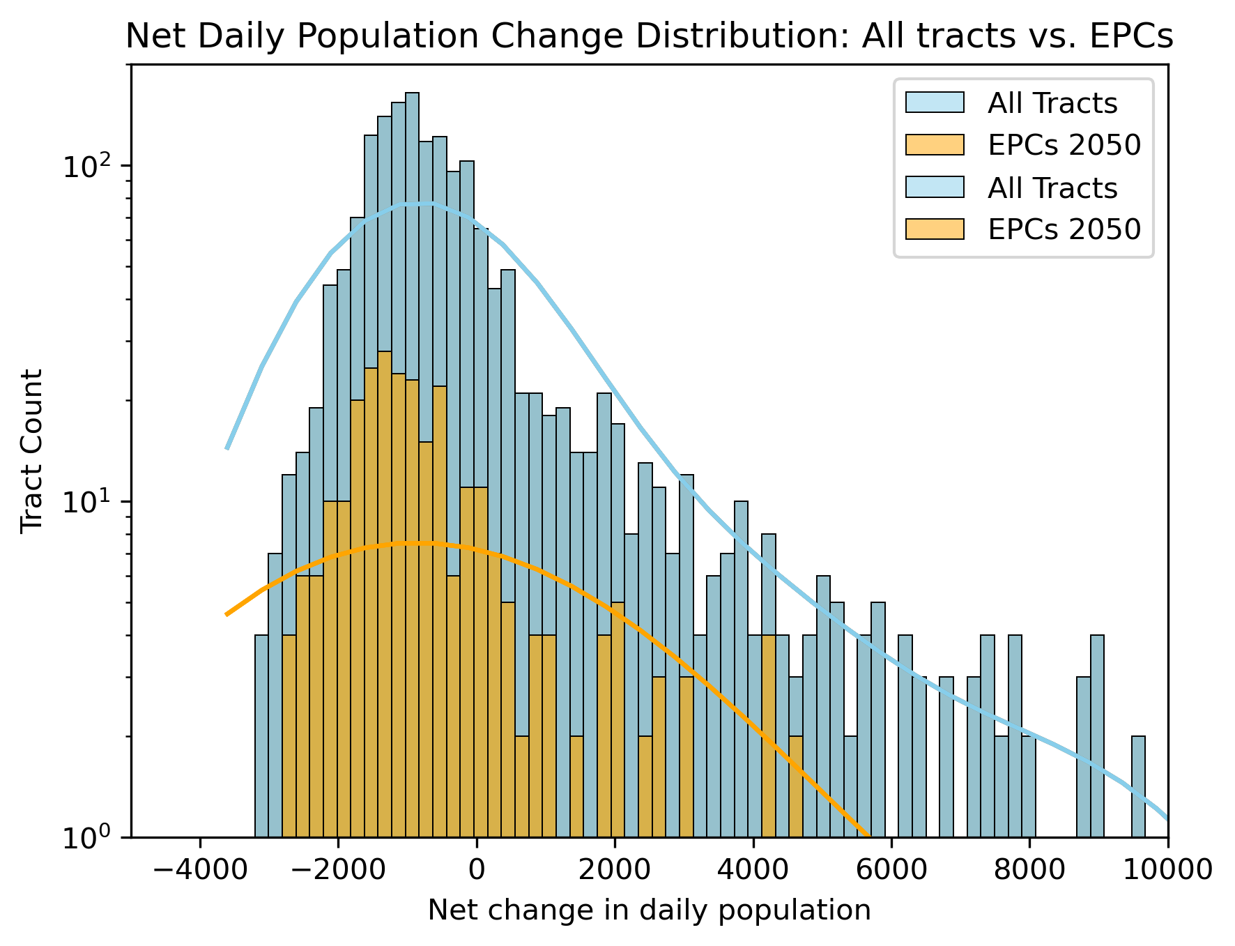
Figure 5. Net daytime population change, EPC vs all Bay Area tracts. LODES8. Census tract level aggregation.
Comparing the net change distribution for EPC tracts against all Bay Area tracts shows that the distribution for EPCs and non-EPCs across the Bay Area have generally the same trend. The peak of both distribututions falls between in the negative region, showing that across the board, tracts most commonly experience a loss of workers during the day. The difference between EPCs and the wider Bay Area becomes apparent when looking at the positive tails - EPCs include far fewer employment hotspots than the wider Bay Area, if any.
The proportion of in- and out-flows from EPCs are similar to the rest of the Bay Area, but are the commutes themselves longer for EPCs?
This doesn't tell us about the specific characteristics of the commute patterns for EPC residents, such as the modes of transportation used or the typical commute times.
How do the commute times for EPC residents compare to those in non-EPC areas?
04 — The commute itself
Where are EPC residents going, and how long does it take them?
To investigate the commute lengths of EPC workers, we modeled travel times by both car and transit for EPCs and their surrounding tracts. A spatial join was performed to find tracts that touched EPC tracts that weren't EPC tracts themselves. We included all non-EPC tracts that touched an EPC tract in our analysis. There are some public transit tracts that have a travel time of zero, this means that R5Py couldn't find a way from the centroid of that tract to the destination tracts associated with it.
Figure 6. Average travel time to work via public transit and car for EPC tracts and their neighbors. Census tract level aggregation.
By examining EPCs and their neighbouring tracts, we can see how broader geography in the Bay Area has a greater impact on travel times than EPC status. For example, San Francisco and Alameda have lower commute times, by both transit and car, than more suburban counties such as Contra Costa.
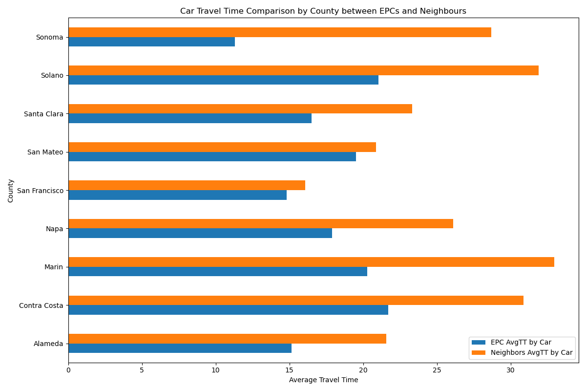
Figure 7. Average travel time to work via car for EPC tracts and their neighbors, for each county in the Bay Area. County level aggregation.
From Figure 7 above, the average travel time by car is generally higher for neighbouring tracts than for EPCs. This difference is wider in more suburban counties such as Sonoma and Marin. This phenomenon is likely due to the location of employment for higher-income tracts, as many of these jobs will be located in urban centers such as San Francisco or Santa Clara, necessitating a longer commute.
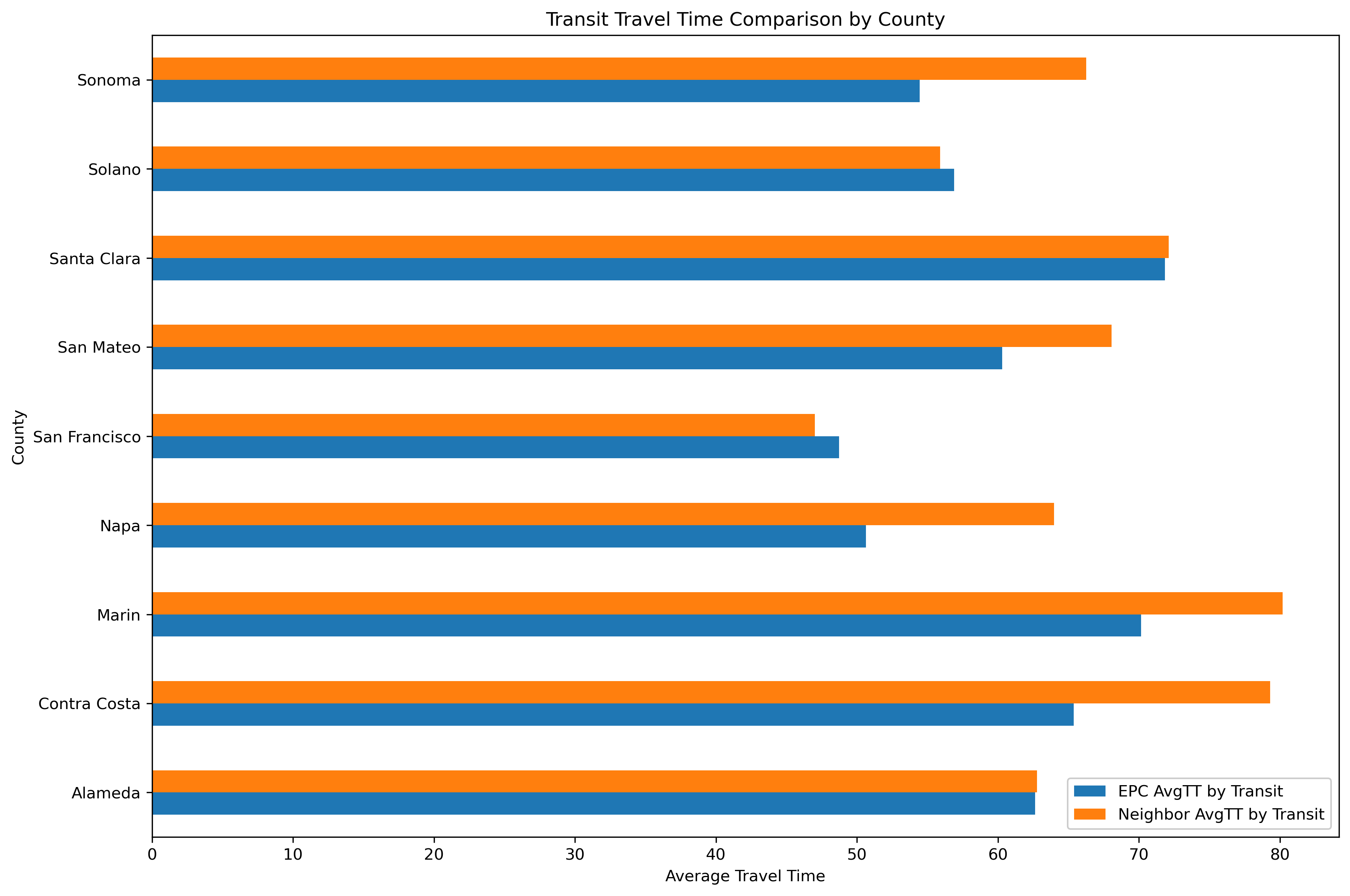
Figure 8. Average travel time to work via public transit for EPC tracts and their neighbors, for each county in the Bay Area. County level aggregation.
From Figure 8 above, the average travel time by transit for EPCs and neighbors of EPCs is quite similar in the more urban counties, and in the counties with a less dense population, it can be seen that the tracts neighboring EPCs actually have longer transit travel times. This is likely due to the fact that EPCs tend to be located in the urban centers, where transit is usually stronger, compared to the more rural counties like Sonoma and Marin. Additionally, as neighbouring tracts may travel further to their employment centers, this may account for a longer travel time.
Figure 7 shows that car travel times tend to be shorter for EPCs than for their neighbors. Because car travel time is modelled with free-flow travel, if we assume that the road network is comprehensive enough, we can use car travel time as a rough proxy for travel distance. Under this assumption, EPC residents live closer to their employment destinations than residents of neighboring census tracts. Figure 8 shows a more similar transit trip time between EPCs and their neighbors. Combining this with the previous assumption then reveals that EPC may be spending the same time traveling on transit to reach closer destinations as their neighbors spend traveling on transit to reach locations further away. This points to a potentially systematically worse transit service connecting EPC residents to their nearby job destinations.
While commute travel times allow direct comparisons between different tracts, the gap between the transit and car commute lengths within the same area reveals how well (or poorly) the transit network serves it's most disadvantaged residents.
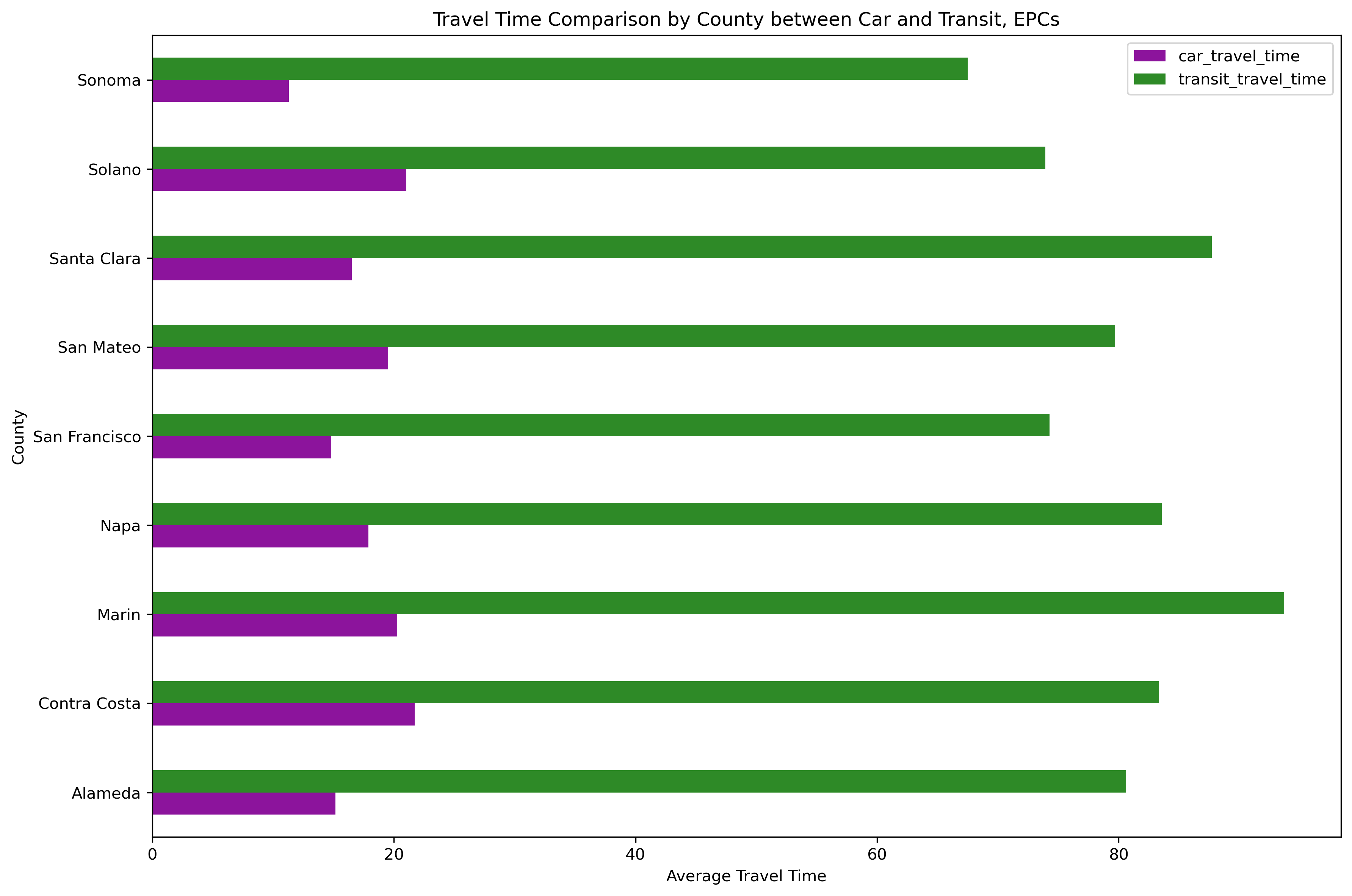
Figure 9. Comparison of Travel Times by Transit and Car in EPC Communities at the County Level
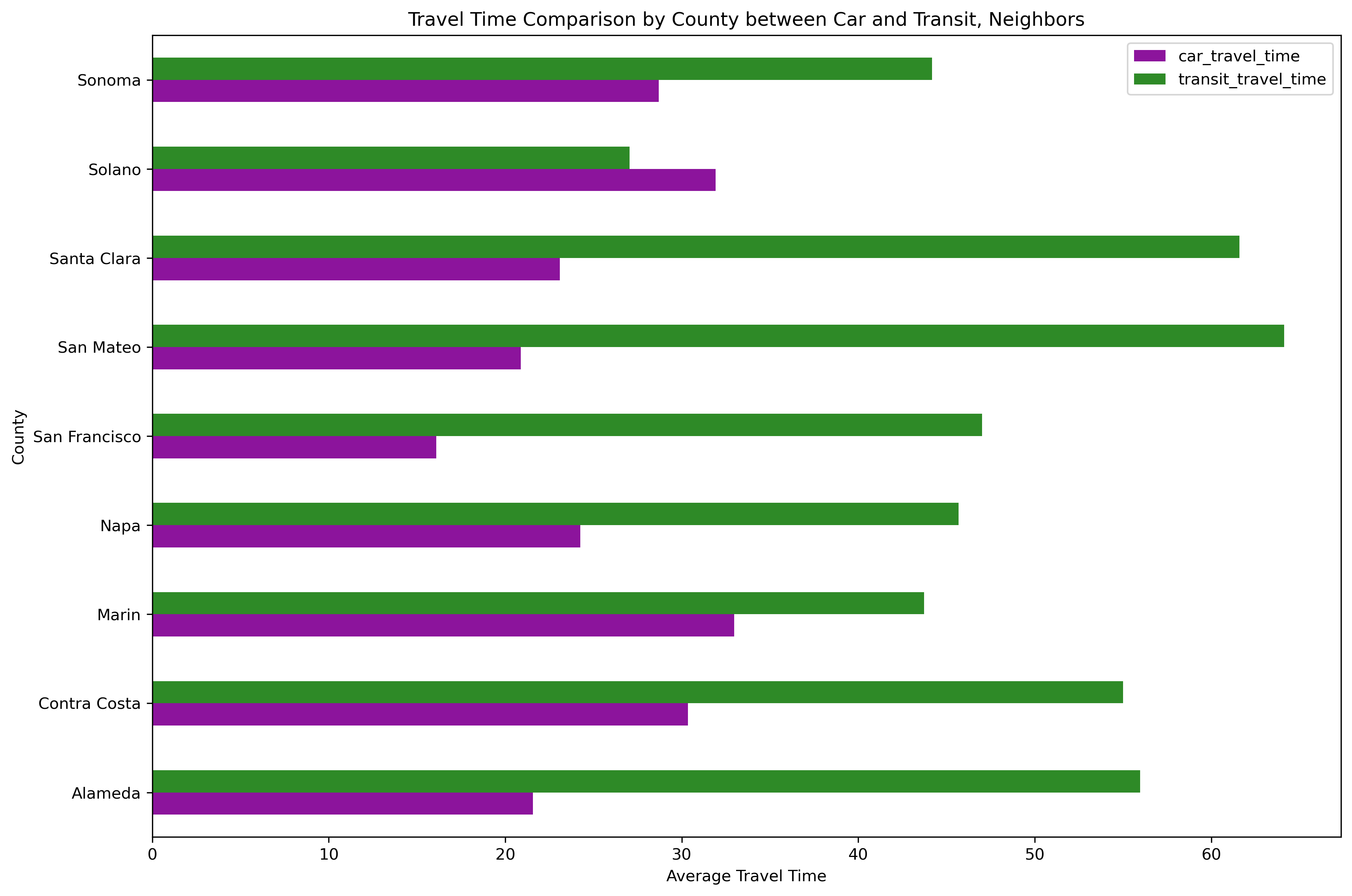
Figure 10. Comparison of Travel Times by Transit and Car in Neighbouring Tracts at the County Level
Figures 9 and 10 highlight how differently car and transit trips serve the commuting patterns of a neighbourhood. In EPCs across the Bay Area, transit trips take much longer compared to the same trip made in a personal vehicle. R5PY only provides free flow travel time; however, even when accounting for congestion, commuting by transit still likely takes longer than by car. In neighbouring tracts, this difference is smaller, highlighting how these neighbourhoods and their work locations are better connected by transit.
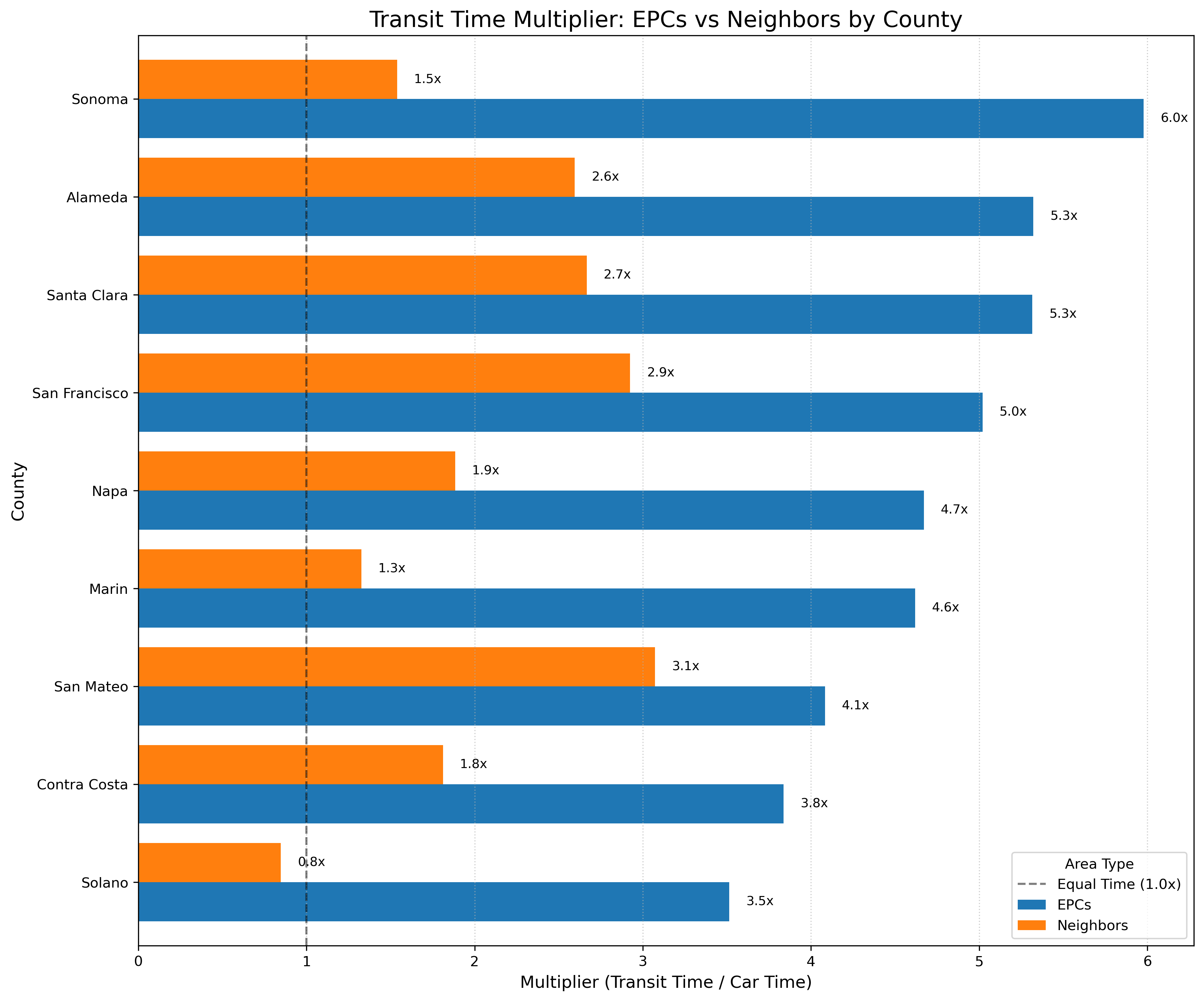
Figure 11. Normalized Transit vs Driving Time by County for EPCs and Neighbouring Tracts
Figure 11 normalizes travel times by representing transit as a multiple of the average car trip. For example, if a commute takes 10 minutes by car and 30 minutes by transit, the transit mulitplier will be 3.0x. This figure shows how transit serves EPC tracts and work destinations more poorly than neighbouring tracts and their work destinations, as EPC communities face much higher transit multiplier scores than their neighbouring tracts.
The transit travel times in this section were calculated using the centroids of each tract. This is obviously not accurate to reality, but there were no more granular geographic locations provided in the LODES data and simulating a variety of origins and destinations within each tract would have been too computationally demanding for the hardware the team had available. Tracts are drawn to capture roughly the same amount of population in each, which means using the centroid in the denser, urban tracts (which are smaller) is a better estimate than the larger, more rural tracts on the edges of the Bay Area.
Conclusion
Transit accessibility is still lacking for EPC employment destinations.
Daily commute patterns throughout the Bay Area are more heavily dependent on region and location than EPC status. EPCs that 'import' and 'export' workers, with no obvious difference between EPCs and their nearest neighbours.
The Bay Area's spatial distribution of residential and employment locations creates an unequal distribution of commute time costs. By comparing car travel time between EPCs and their neighbours, neighbouring tracts often travel for longer times (and therefore distances) than EPCs. This pattern is especially noticeable in more suburban counties such as Marin and Sonoma, which may be because higher income neighbourhoods may travel further to employment centers in San Francisco or Santa Clara. Comparing average trip times by car vs by transit in EPCs and their neighbouring tracts, based on the distribution of commute patterns, travel time by transit is much higher in EPCs than in non-EPCs. Again, this could be explained by the tendency for higher-paying jobs to be near employment centers which are more easily accessible by transit.
Data sources
- LODES8 Origin-Destination Employment Statistics
census.gov/lehd - (ACS Table ID) American Community Survey
data.census.gov - MTC Equity Priority Communities shapefile, (year)
mtc.ca.gov
Tools & methods
- Python · pandas · geopandas · matplotlib
- Folium · Plotly
- CYPLAN 255, UC Berkeley, Spring 2026
Code & reproducibility
View on GitHubClone the repo and run pip install -r requirements.txt, then run the scripts in the order provided in the readme.txt